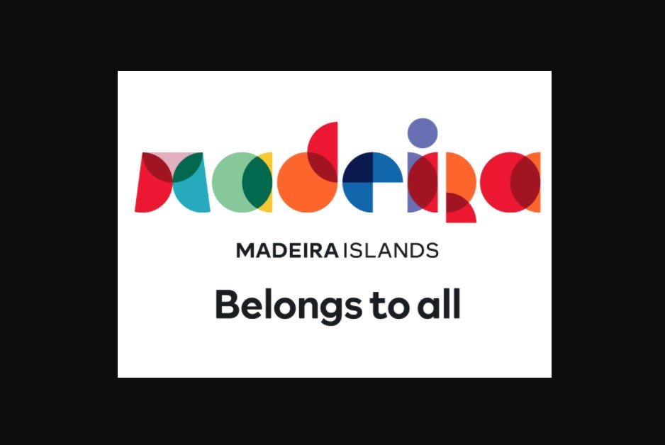
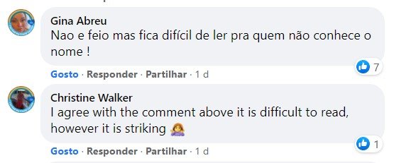
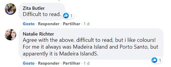
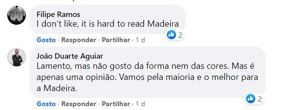
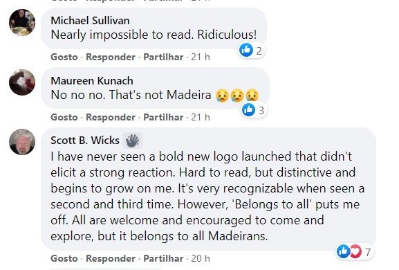
The new Madeira brand presented this Monday has received a lot of criticism on social networks.
Comments such as “is it difficult to read”, or “did you hand over the marketing department to an intern?”, Can be read on Facebook, regarding the presentation of the new brand.
Comments in English and Portuguese can be seen, commenting that the design “was not well granted” and that “it does not have coherence” relates the design chosen to design Madeira.
A nova marca Madeira apresentada esta segunda-feira tem recebido muitas críticas nas redes sociais.
Observações como “é difícil de ler”, ou “entregaram o departamento de marketing a um estagiário?”, podem ler-se no Facebook, em relação à apresentação da nova marca.
Comentários em inglês e em português podem ser vistos, comentando que o design “não foi bem concedido” e que “não tem coerência” em relação ao design escolhido para projetar a Madeira.
I am a professional graphic designer, and I don’t agree with that criticism. New logo is legible, modern and it fits to the characteristics of Madeira. I guess that one of the assumptions, was to attract new citizens to the island, and I think it will work. People just criticize everything that’s new and a bit different than previous 🙂